Tips for Creating Top Landing Pages
Landing pages can a bit of an enigma. More often than not, they’re a little bit of everything: homepage, content page, and contact page. They’re kind-of like the tapas of web pages. So if you are looking to optimize your landing pages for either business conversion or customer experience, there are some definite ways to make it successful.
To start with, most industry experts feel that these 7 steps detailed below breakdown how to create a successful landing page:
- Make Sure to Utilize a clear Call to Action
- Match the Call-to-Action and On-Page Message Clearly with Any Promises Made Off-Page
- Utilize a Simple Design while keeping On-Page Text Concise
- Do Not Overload the Page with Images
- Illustrate a Clear Brand
- Clearly show Social Icons for SMO Principles
- Test it like Crazy
Example 1
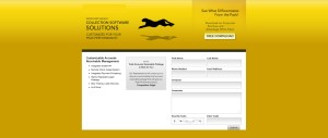
This business’s goal was to produce a concise landing page to engage viewers. This was a page developed to obtain information for prospective clients. Turning cold calls, into warm ones.
What They Did Well:
- The Design: Designed by a local Philadelphia internet marketing team, this page utilized an overall design that is very clean and simple. It engages with the icon in the center, and uses clear lines to segment the data on screen. They also utilized bullet points to produce concise content, with very few changes in font style. Additionally, the header has a clear call to action to download their brochure.
- The Images: The choice of using yellow is a calculated one, as it is the most visible and eye-catching color. They also use the a moving icon to keep the viewers attention. The button for the free download of the brochure is clear as well.
- Establishing a Brand: This page keeps their logos and calls to action on the top half of the screen, showcasing confidence in their brand
Example 2
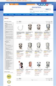
This business’s goal, helped in part by a local Philadelphia SEO company, was to deliver a manufacturers landing page to showcase their top products. This was a page developed to entice readers to buy the listed products.
What They Did Well:
- Structured Products: Products listed on-page are clear and easy to distinguish. These products have the breakdown of the name, price, and best of all: a ratings system. This showcases everything the consumer would want to know, even before clicking.
- Leading Manufacturers and Best Products: Each of these products is very specific to the consumer, as these are the top products available. The page also utilizes side navigation, and the ability to sort by name or position. While targeting local areas like New Jersey and Philadelphia SEO for this page has a further reach.
- Verification: This landing page also utilizes web-based security icons that instills confidence for the customer to purchase an item online.
- Social Icons: Clear and visual, the re-engagement process is key with any e Commerce company, and often increases the likelihood of repeat conversions.
Example 3
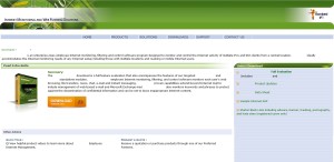
Taken on by a local Philadelphia SEO company, this landing page was designed to showcase the client’s new software available for purchase. This was a page developed to provide the specifics of the product, while still delivering a clear call to action.
What They Did Well:
Product Identification: While this is a product that is directly downloaded after the point of sale, research shows that people like to see something tangible when making a purchase. To counteract that, this page created packaged boxes icons for each of it’s products.
Attention-getting Button: Using a large orange button right next to the product icon, the viewers eyes are instantly drawn to it. This is key as it instills the idea of purchasing the product quickly, while making it clear where to click when looking to check-out.
Concise Summary: This page provides a description of the product that is short, sweet, and to the point. Remember, a product description should not be a long sprawling text about every facet of the product, it should be an overview of what it can do. Attention spans are short online, cut to the chase as soon as possible.
Branding: The name of the software, as well as the company is implemented into almost every facet of the page. While the landing page itself looks like the rest of the site, creating continuity.
